1. 风格定调
最近 Claude 官方在博客里把“AI 生成前端为什么总是紫紫灰灰、一股 LLM 模板味”讲得特别清楚。核心不是模型审美差,而是我们给的 prompt 太“空”。
最好的前端模型就是 gemini,但是非常不建议让他自己去生成 CSS 和组件,最好是在设计开始的时候就规范好 风格配色、使用什么组件库,统一什么风格等等。
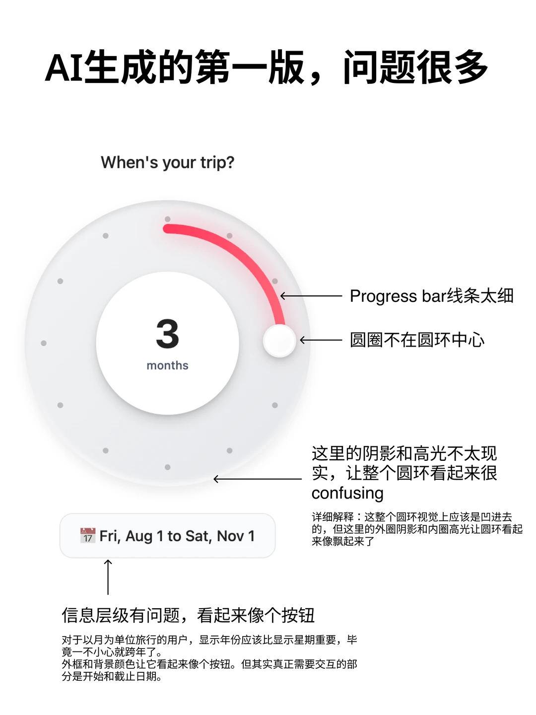
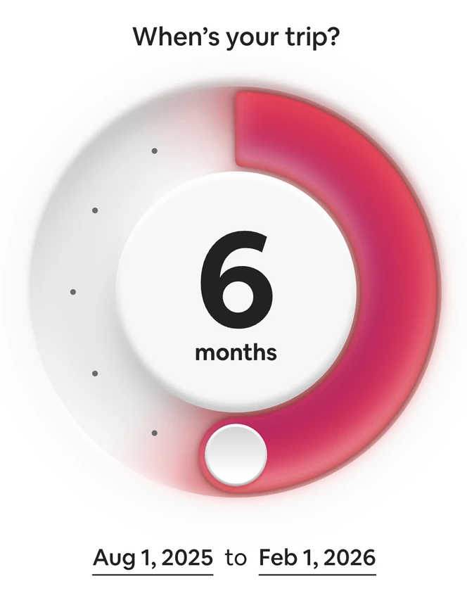
典型错误:UI 风格不统一:
- 这个页面圆角 8px,另一个 12px
- 按钮颜色五花八门,间距忽大忽小
- 阴影风格一会是 Material ,一会是 IOS
1)先定义“设计语气”,而不是让模型自由发挥 Claude 的技巧是:把网页当成“叙事产品”,你要告诉它整体气质,比如:
更克制的留白 • 强对比排版 • 非玻璃拟态 • 降低视觉噪声
这一步决定整个页面的骨架,避免落回默认紫色模板美学。
2)提前写好“设计约束”让模型不乱来 比如:
不要圆角卡片堆叠 • 不要渐变背景 • 不要玻璃拟态 • 色彩只允许 2 个主色 + 1 个强调色
Claude Skills 会把这些当作硬规则执行,生成结果干净很多。
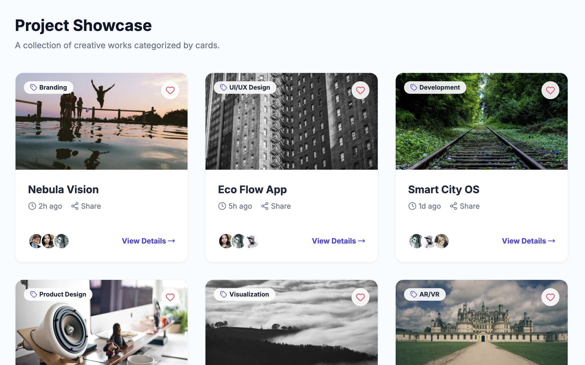
3)把页面拆成组件,让模型逐块设计 Claude 强调组件化设计:
hero 区 • 信息区 • 按钮体系 • 表格/卡片结构
这样每块都会更“像是人设计的”,而不是一坨整页风格混杂的东西。
4)提供真实内容,而不是“lorem ipsum” 这是最关键的地方之一。Claude 会根据内容理解信息层级:
哪个标题更重要 • 哪块需要视觉重心 • 哪个信息要弱化
所以一定要用真实文案,它会自动做视觉节奏。
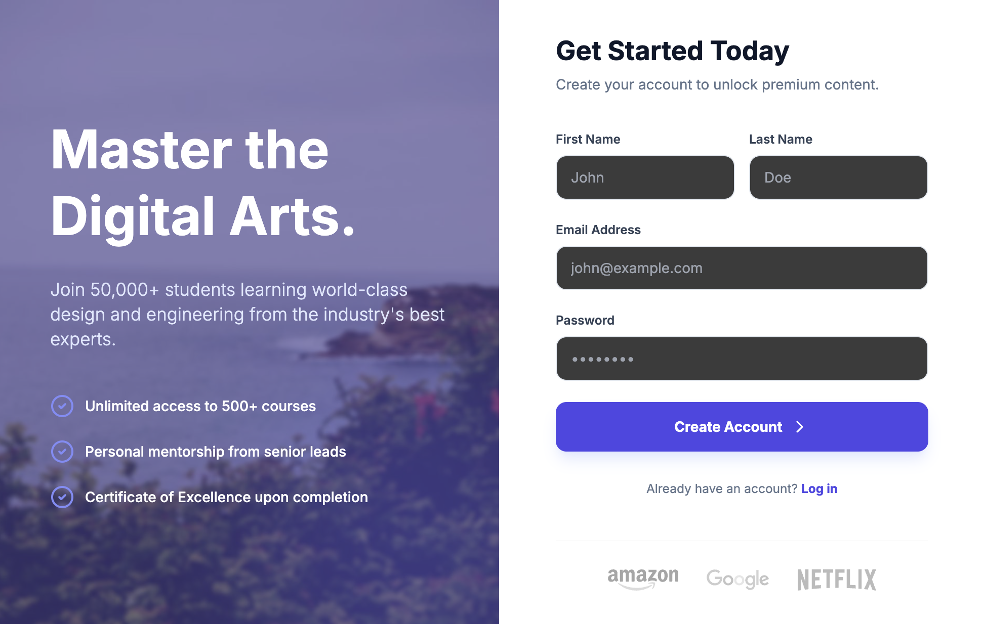
Cursor 操作步骤:
-
不要让AI 原生写 css,直接让 AI 使用
Tailwind CSS+Shadcn/UI/untitled ui。这两者有丰富的 LLM 训练数据,且很容易调用。 -
在根目录创建一个
design_system.md,只定义变量# Design System Rules ## 1. Color Palette (Tailwind) - Primary: Zinc-900 (Action buttons, heavy text) - Secondary: Zinc-100 (Backgrounds, cards) - Accent: Indigo-600 (Highlights, links) - Semantic: - Success: Emerald-500 - Error: Rose-500 ## 2. Typography - Font Family: Inter, system-ui, sans-serif - Scale: - H1: text-4xl font-bold tracking-tight - H2: text-2xl font-semibold - Body: text-base leading-7 text-gray-700 - Small: text-sm text-gray-500 ## 3. Spacing & Radius - Base Unit: 4px (Tailwind standard) - Border Radius: - Buttons/Inputs: rounded-md (6px) - Cards: rounded-lg (8px) - Padding: - Card: p-6 - Section: py-12 px-4 ## 4. Component Philosophy - Style: Minimalist, clean, lots of whitespace. - Shadows: shadow-sm for cards, shadow-md for hover. - Buttons: Always use Shadcn <Button> component. -
把上面的规则精简后,直接放进项目根目录的:
.cursorrules,这样 AI 写的每一行代码都会自动遵守规范。通用 Prompt 话术(直接喂给 AI)"Read the @design_system.md file. From now on, every UI component you generate MUST strictly follow these color variables, spacing rules, and typography scales. Do not invent new styles. Use existing Shadcn components wherever possible." -
不要试图让 AI 一句话生成整个 Dashboard,否则它大概率会开始乱发挥。
-
先生成原子组件:
"Create a primary button and a secondary button based on the design system." -
再生成区块:
"Build a login card using the buttons and typography defined." -
最后组装页面: 这样拼出来的页面,一致性 100%。
-
有趣的 prompt
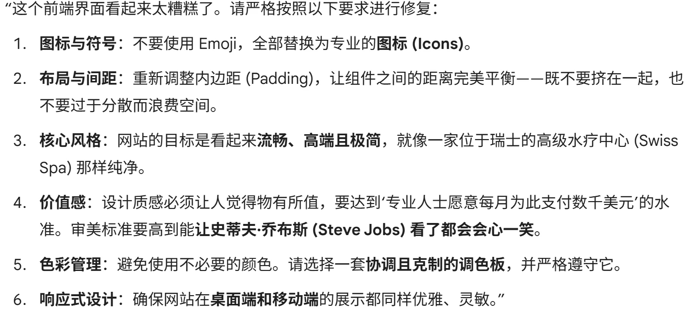
This frontend looks terrible. Fix in accordance to the following:

Instead of emojis, use icons. Fix the padding so every component is spaced perfectly - not too close to other components but not too dispersed to waste space.

The goal of the site is to look sleek, premium, and minimalist, like a spa in Switzerland. Design this in a way that matches what a working professional would reasonably pay thousands of dollars a month for, in a way that would make Steve Jobs smile.

Avoid using colors unnecessarily, instead pick from a palette that is cohesive and stick to it. Ensure the site is responsive and elegant on both desktop and mobile.
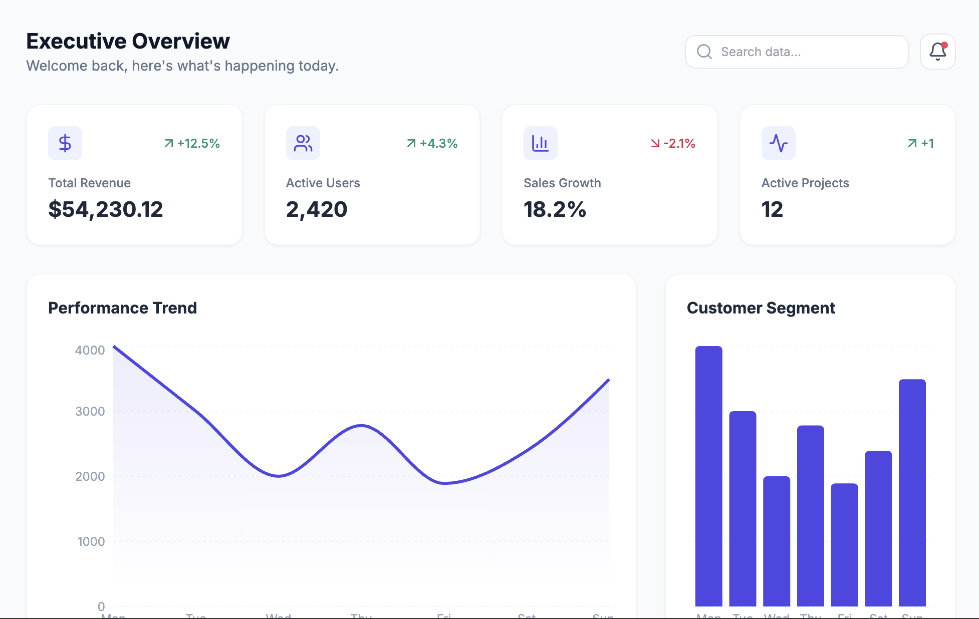
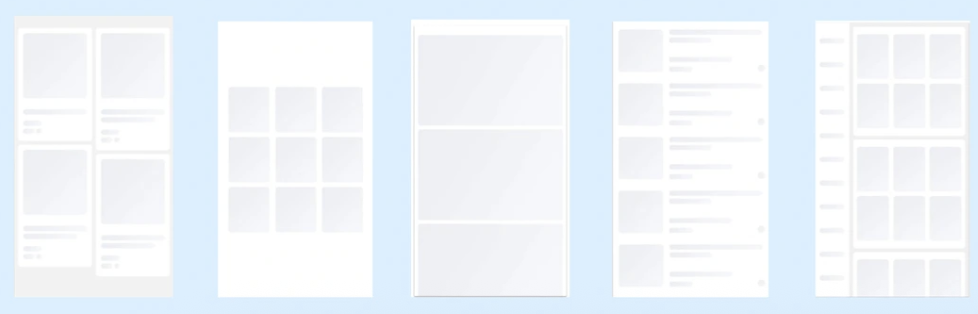
布局模型关键词:
-
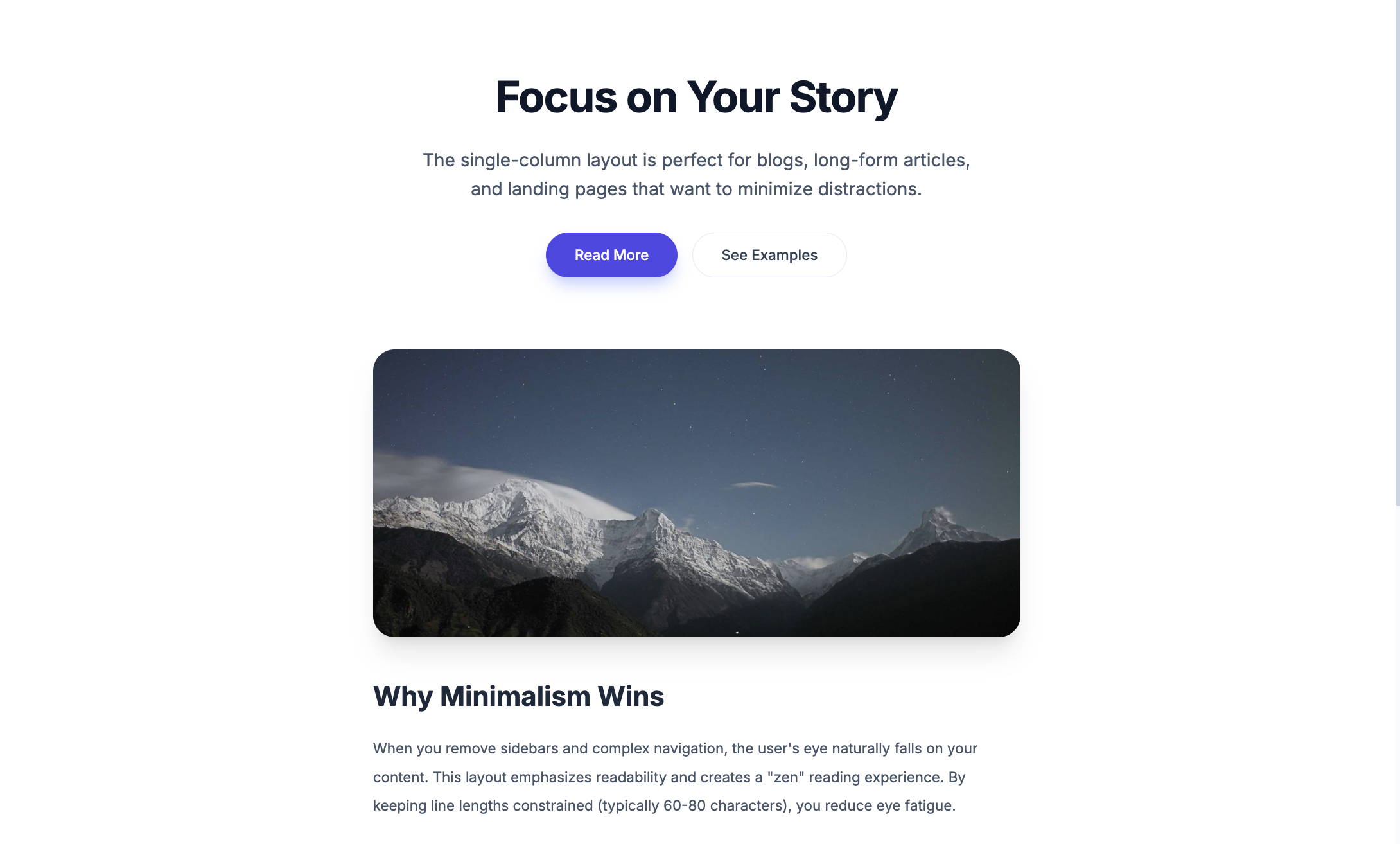
Single-column Layout(单列布局)
-
Dashboard Layout(仪表盘布局)
-
Card-based Layout(卡片式布局)
-
Z-pattern Layout(Z型布局)
-
Split-screen Layout(分屏布局)
-
Bottom Navigation Layout(底部导航布局)
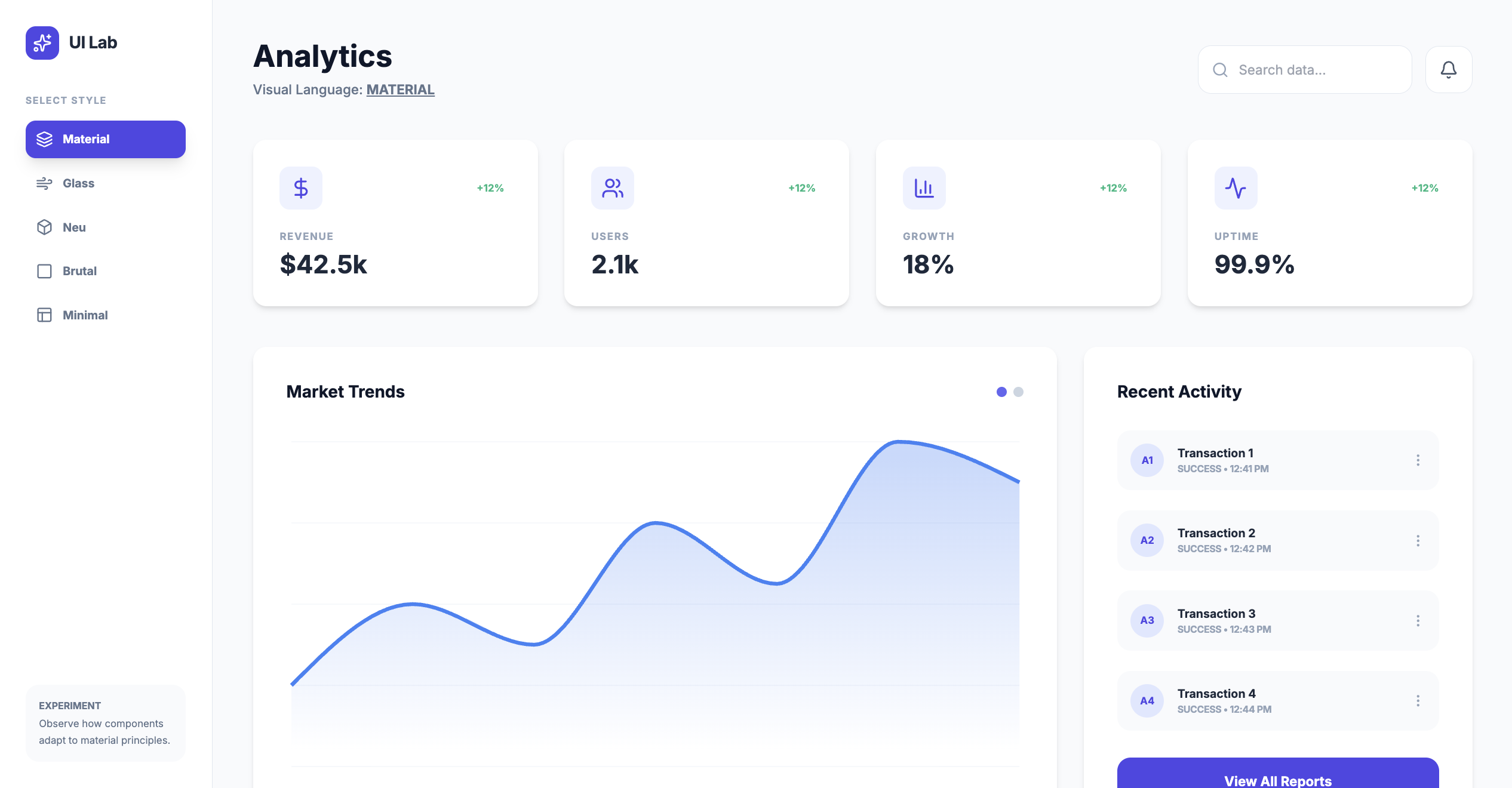
设计风格关键词:
-
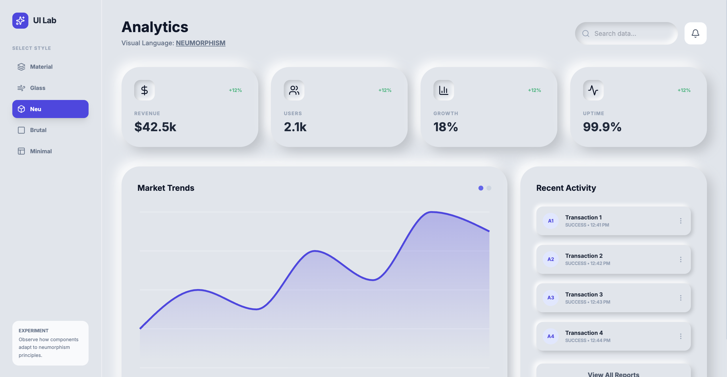
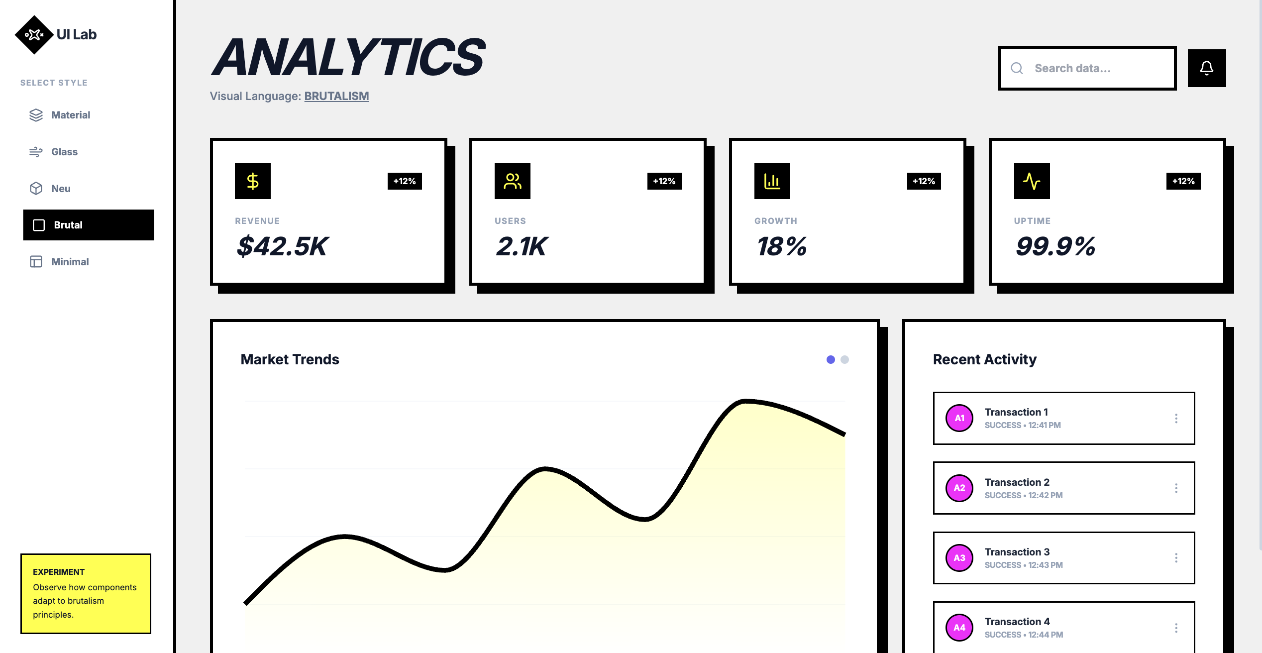
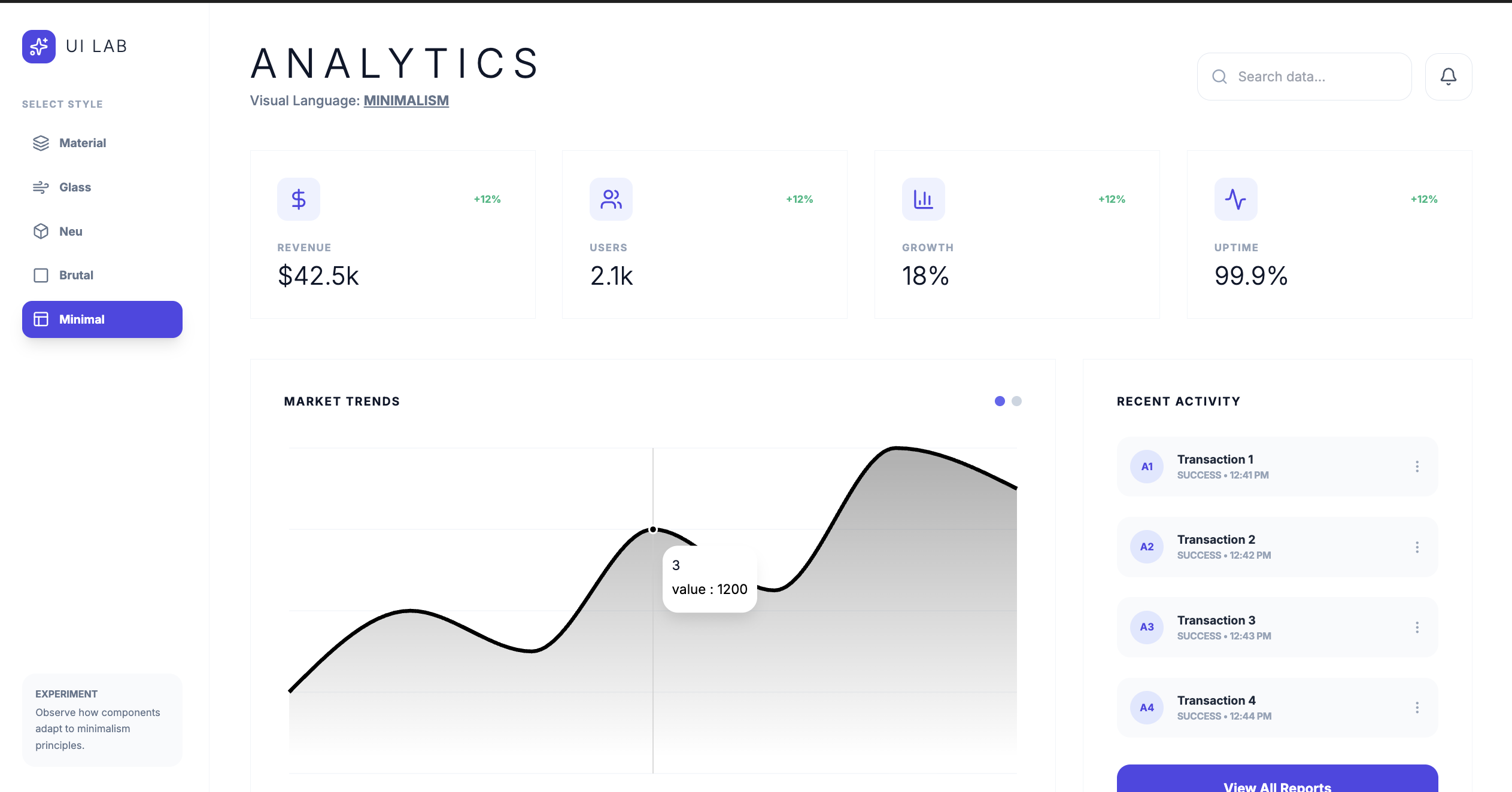
Material Design(材料设计)
-
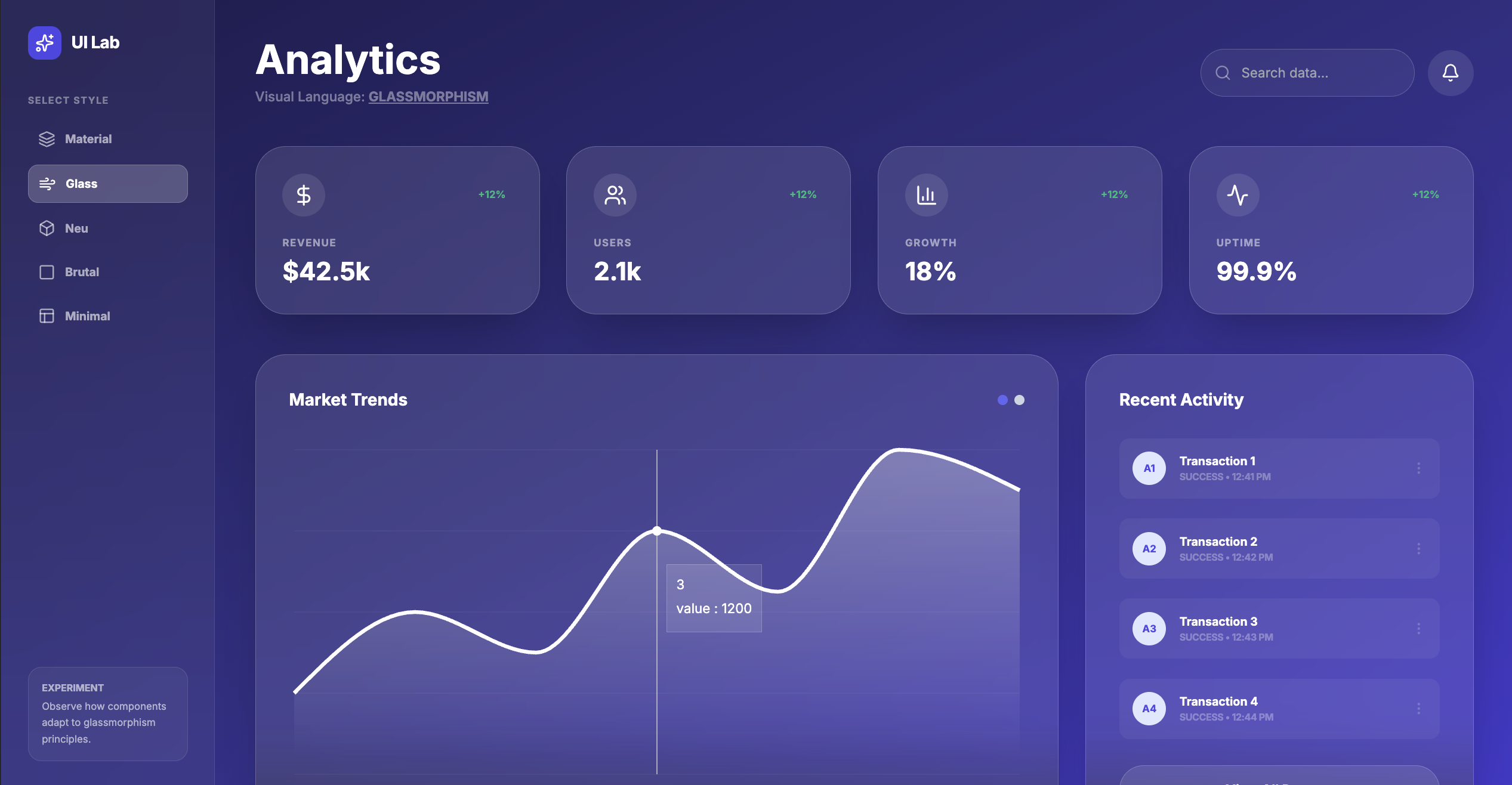
Glassmorphism(玻璃拟态)
-
Neumorphism(新拟态)
-
Brutalism(粗野主义)
-
Minimalism(极简主义)
组件与模式关键词:
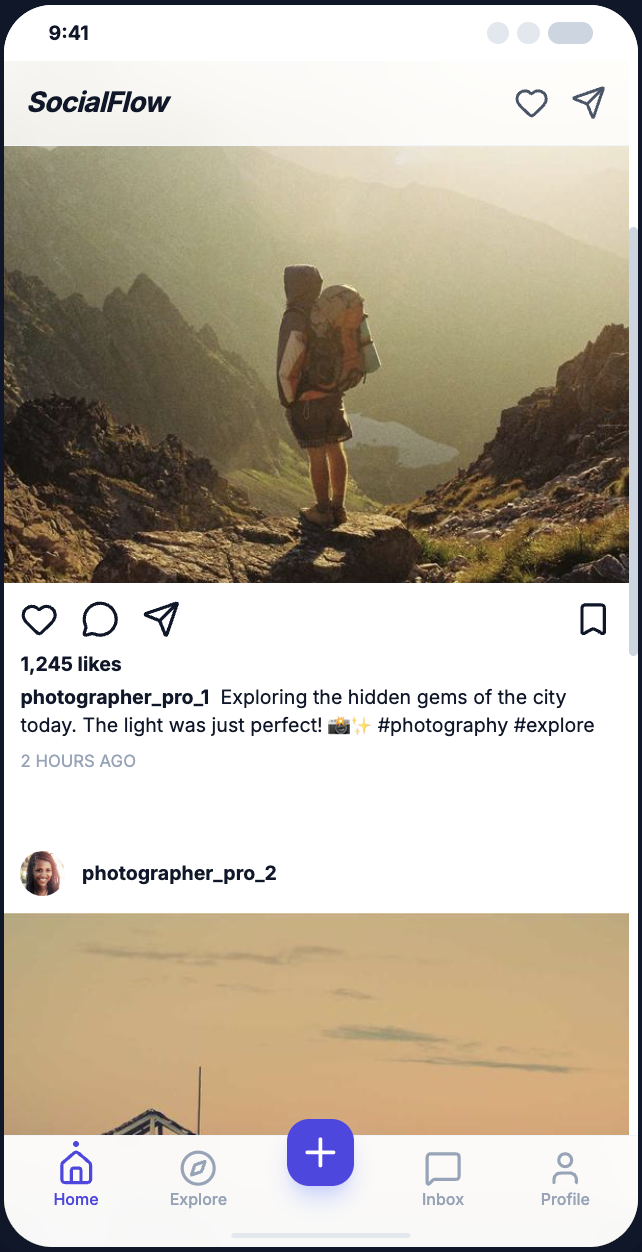
- Floating Action Button(悬浮动作按钮)
- App Bar/Bottom Bar(顶部/底部应用栏)
- Modal Sheet/Bottom Sheet(模态表单/底部表单)
- Data Table(数据表格)
- Infinite Scroll(无限滚动)
一个优化案例
网页开场
中文提示词:
当元素进入视口时触发动画——淡入、滑入、模糊进入,按元素逐个呈现。使用 “both” 而非 “forwards”。不要使用 opacity 0。
英文提示词:
 Intro + animation on scroll:
 "Animate when in view: fade in, slide in, blur in, element by element. Use 'both' instead of 'forwards'. Don't use opacity 0."
按钮
中文提示词:
在用户悬停时,为胶囊形按钮添加一条 1px 的边框光束动画。
英文提示词:
Add a 1px border beam animation around the pill-shaped button on hover.
文本
中文提示词:
为垂直文字片段添加逐字母向下滑动的动画效果。
英文提示词:
Add a vertical text clip slide down animation letter by letter.
卡片
中文提示词:
在鼠标悬停或移动时,为卡片的背景和边框加入轻微的“手电筒”光斑效果。
英文提示词:
Add a subtle flashlight effect on hover/mouse position to both background and border of the cards.
内容移动
中文提示词:
让卡片在 Alpha 蒙版下以缓慢的速度无限循环滚动动画
英文提示词:
Make the cards animate marquees in an infinite loop with alpha mask slowly.
更好的 flow:
核心内容如下:用 Google Gemini(免费版即可)通过精心设计的提示词,一键生成带动画、完全响应式的落地页(landing page)。 他把精力80%放在 Hero 区(页面顶部大banner,主要实现工具是 Unicorn Studio,已�收录在我们的工具模块),因为这是用户第一眼看的东西,决定留不留下来。
具体流程:
-
从 Supahero 截图顶级 Hero 设计,
-
从 Mobbin/dribble 截移动端和各模块参考,
-
从 Bento Grids 找流行网格cards布局,
将其内容修改以适配 Hero -
从 CTA.gallery 找 按钮 设计
-
从 H1 Gallery 找 hooks 和 headline。
-
从 ICONify 找 Icon 集的名字,注意其中的 Lucid icon 已被滥用 。也可以找到企业 Logo
把这些截图喂给 Gemini,用“正向提示词 + 负向提示词”精准控制输出。 生成的图片如果有问题,再丢到 Midjourney 手动修复。
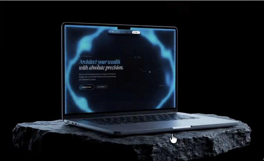
最后用 Aura build(一个AI模板编辑器)把代码和素材快速拼成可直接卖的模板。 一个模板做好后,稍微换颜色、换文字,就能卖 50-100 美元,速度极快。 社区评论的核心共识: 现在 AI 已经能把“执行”这部分干得七七八八了,真正拉开差距的只剩“品味”(taste)。
最后还可以 AI 生图把图片放到现实场景中作为概念图,比如用 Nanomana Pro。