2. 按钮特辑
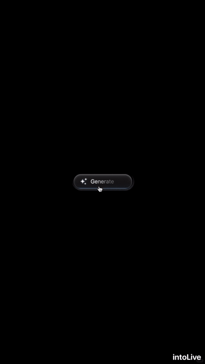
1. 表示异步生成、不跳转的按钮
中文提示词:
交互式调用按钮,使用 Tailwind 进行样式化。呈现星形图标,并在文字上实现 “Generate / Generating” 的逐字切换效果,适用于内容生成类触发操作或异步任务场景。
英文提示词:
Interactive call-to-action button styled with Tailwind. Displays star icon and letter-by-letter text swap between Generate and Generating, ideal for content creation triggers or async actions.
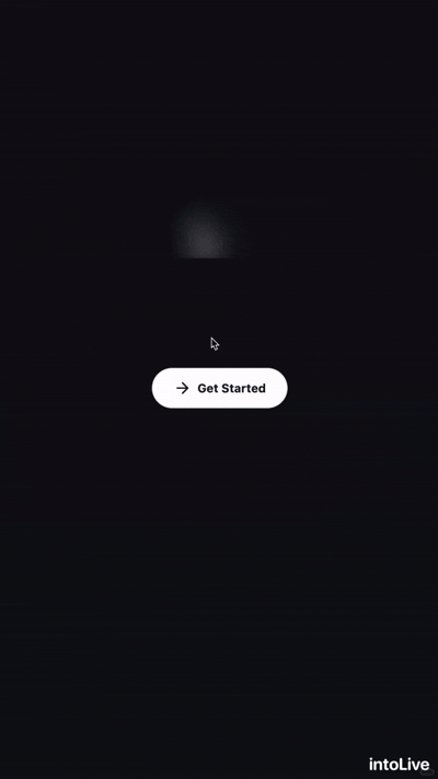
2. 一级按钮类,强提示
中文提示词:
交互式行动按钮,带有右箭头 SVG 图标,并通过基于光标位置的 CSS 变量实现自定义光晕效果。适用于首页视觉区或引导流程提示。
英文提示词:
Interactive call-to-action button featuring a right-arrow SVG icon and custom glow effect driven by CSS variables for cursor position. Ideal for hero sections or onboarding prompts.
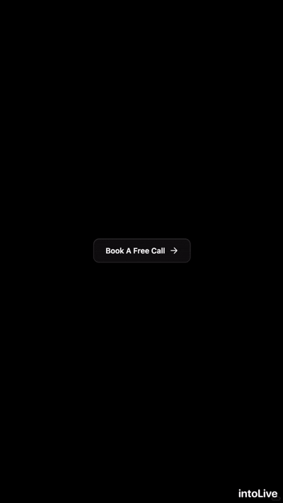
3. 适用次级按钮类,高互动
中文提示词: 使用 Tailwind CSS 设计风格,包含滑入式模糊入场动画、随鼠标移动的动态光晕、悬停时的下划线延展,以及箭头图标的位移效果。
英文提示词: Call-to-action button styled with Tailwind CSS featuring slide-in blur entrance, dynamic mouse-move glow, underline expansion and arrow icon shift on hover. Ideal for landing pages or forms requiring an engaging “Book a Call” prompt.
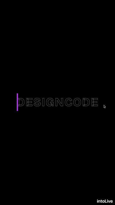
4. 文字类按钮
中文提示词: 一个带有霓虹紫色发光效果的动画按钮,悬停时会以打字光标动画呈现彩色文字。适用于现代感、未来感界面。
英文提示词: An animated button with neon purple glow effect that reveals colored text with typing cursor animation on hover. Perfect for modern, futuristic interfaces.
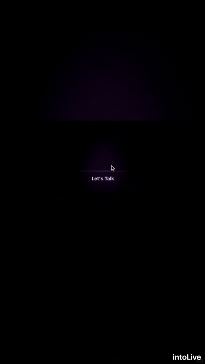
5. 隐藏性按钮
中文提示词: 一个交互式行动按钮,具有紫色滑动光晕叠层、渐变暗角效果,以及悬停时出现的细顶部线条。使用 Tailwind CSS 工具类与自定义关键帧动画构建,适用于联系链接或需要突出 CTA 的首页视觉区域。
英文提示词: Interactive call-to-action button with sliding purple glow overlay, gradient vignette, and subtle top line on hover. Built with Tailwind CSS utilities and custom keyframe animation, perfect for contact links or hero sections needing an eye-catching CTA.
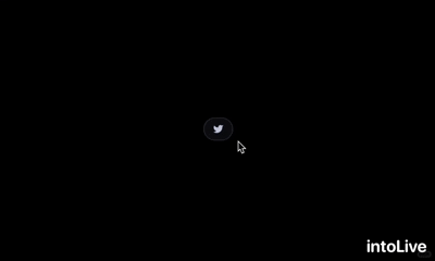
6. icon 类按钮
中文提示词:
带有玻璃拟态风格和悬停动效的浮动社交媒体图标,可用于页脚或侧边栏,支持链接到 Twitter。
英文提示词:
Floating social media icons with glass morphism styling and hover effects. Perfect for footer or sidebar placement with Twitter.